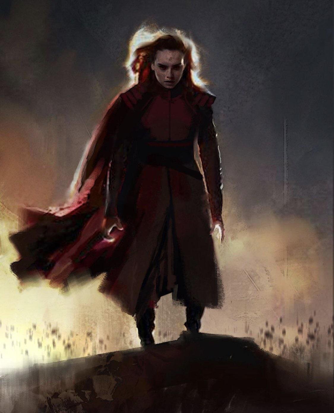
'Star Wars' Just Revealed Rey's "Alternate" Dark Side Design Concept Art
Some of the best parts of films or TV shows are when fans get to see concept art for the production, especially if it is a sci-fi or fantasy story. At the end of each episode of The Mandalorian, concept art is shown during the end credits of the episode. Some of it looks like what actually made it to screen, and some of it does not. For example, in season 2 of The Mandalorian, "Chapter 12: The Siege" had Grogu eating what looked like a blue macaroon cookie. In the concept art during the credits, the cookies were not colored blue yet.
It’s so much fun to see all the work given to the movies and shows come up with the right aesthetic and look. Star Wars concept art especially is some of the most amazing art.
Recently, Adam Brockbank, a film concept artist and illustrator who worked on The Rise of Skywalker, released two images of one concept for Dark Rey. He posted the photos on his Instagram, @brockbankadam, with the caption:
“Dark Rey, development stage concept for TROS #starwars #starwarsconceptart #conceptart #artofriseofskywalker #darkrey #tros #darkside”
The first image is a full body display, and the second one is a closeup of Dark Rey’s face and torso. Her hair is being blown behind her, as is her cloak, like she is giving off an energy source. She does not carry a lightsaber, which is very different from the concept that they did go with in the movie. She is wearing a belt, but it is unclear as to whether or not there is a lightsaber attached.
The concept art is very different from what actually made it on screen for Dark Rey. In the movie, they went with black clothing instead of the red as shown in this concept art. She is wearing the black hood of her cape over her head and the only red is her eyes and the reflections of her double bladed red lightsaber. Her face isn’t quite as changed from what she looks like normally.
In this newly released concept art, Dark Rey is wearing red instead of black. Her outfit is similar to medieval armor in style with shoulder pads and a breastplate. Her hair even seems to have a tint of red in it. She gives off similar vibes to Marvel’s Scarlett Witch with this outfit. Her face is also disfigured and changed instead of looking more like her normal face. She looks more dangerous and action ready instead of the menacing vibe that the look they went with for the movie gives off. It's different from the hooded Sith look that we often see in Star Wars.
Let’s face it, the original concept art looks a little bit more like someone you would not want to meet down a dark alley. Even though the look they did go with does give off some pretty evil vibes, it’s just nothing compared to this concept art. Many fans are saying that they would rather have seen this in the movie instead of the one they went with.
We don’t know exactly why the team went with the concept that they did instead of this look. Many people are a part of the decision with what ends up being on screen and in the storytelling. Concept artists, make up and costume artists, directors, and many more. It’s a team effort to come up with the aesthetic that they think goes with what they are trying to tell in the story. This means that there are usually many variations of one concept, especially if it is something as important as Dark Rey. There are probably many other drawings like this one with various different tweaks and designs, colors, etc.
Adam Brockbank also worked on Solo: A Star Wars Story and The Last Jedi. So perhaps in the future we will see more concept art from those films on his Instagram as well!
Source(s): Adam Brockbank’s Instagram


